Motion design

Lott of Social: Motion design with sunny looks & funny hooks
2 min read
“Fresh like grapefruits, camera like photos, sun like light, and I don’t drink coffee.” That basically was the entire brief I got for the new logo.
My colleague and friend had founded her own social media marketing business, and her efforts deserved a lively logo to go with it. Rather than having long documents and endless bullet points, I’ve discovered that the best briefs, like the one above, are often just a few sharp lines that capture the essential information and the right vibe. Since her brand is full of (lott of) sunny looks and funny hooks, I wanted the logo to reflect that same energy.
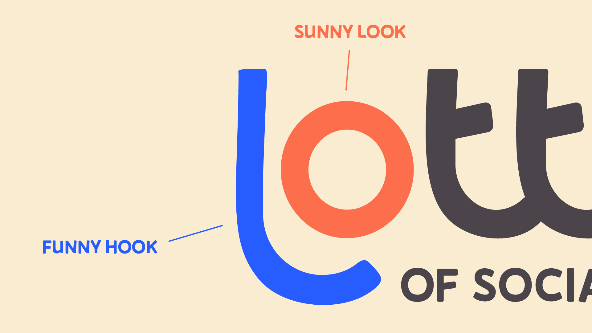
After creating the static logo, sketching some elements and combining it all with the brief full of sun, sea, and grapefruits, I saw the obvious: the grapefruit slices should turn into camera shutter edges. From there, the idea expanded into a full motion design project.
Greetings from Lotta: I dropped the logo on my socials and the feedback there was quite welcoming: ”love it, amazing, phenomenal, cool, so satisfying” and my personal favorite: ”sopii ku nenä päähän!” (fits like a nose on a face).
This project was another proof that understanding what the customer needs and having fun along the way is a great recipe for a successful outcome. I somehow even managed to include the coffee-drinking aspect by leaving it out entirely.
Make sure to check out @lottofsocial on Instagram and Tiktok.
This project was another proof that understanding what the customer needs and having fun along the way is a great recipe for a successful outcome. I somehow even managed to include the coffee-drinking aspect by leaving it out entirely.
Make sure to check out @lottofsocial on Instagram and Tiktok.

Discover next


